
Change the font on any website: Lexend, Atkinson Hyperlegible or OpenDyslexic
Emboldened replaces the font on any web page with one of three bundled typefaces chosen for readability: Lexend, Atkinson Hyperlegible or OpenDyslexic. It’s free, it applies live without a reload, and because the fonts ship inside the extension they work offline and on every site.
Does a dyslexia font actually help?
Honestly: the picture is mixed, and it pays to know it before you pick a font. The most-cited study is Rello and Baeza-Yates, “Good Fonts for Dyslexia” (ACM ASSETS, 2013). Forty-eight readers with dyslexia aged 11 to 50 read texts in twelve fonts while an eye tracker measured reading time and fixation. Sans-serif, monospaced and upright fonts came out best; italics were clearly worse. OpenDyslexic, the font designed specifically for dyslexia, did not improve reading speed or fixation, and readers preferred Verdana and Helvetica to it. A 2016 study by Wery and Diliberto found the same with primary-school children.
What that research does support is a plain sans-serif face with distinct letterforms and comfortable spacing, which is also what the British Dyslexia Association’s style guide recommends. It also supports letting the reader choose, because preference was part of what drove performance. Which is why Emboldened offers three different fonts rather than imposing one, and why the font sits beside letter spacing, which has much stronger evidence behind it. There’s a longer discussion in dyslexia-friendly fonts explained.
The three fonts, and who each suits
- Atkinson Hyperlegible, from the Braille Institute, is designed so that easily confused letters and numbers (I, l, 1; O, 0; b, d) are clearly different from each other. It looks like an ordinary clean sans-serif, which is why Emboldened uses it for its own screens. A good default if you want legibility without the page looking unusual.
- Lexend was developed from work on reading fluency; its letters are wide and its spacing generous. It’s the most “open” of the three and suits readers who find text crowded even at normal spacing.
- OpenDyslexic has weighted bottoms on each letter, meant to stop letters appearing to rotate or flip. The evidence that it speeds up reading is weak, as above, but a number of readers like it and find pages feel steadier in it. If it works for you, that’s the test that matters.
All three are open-licence fonts, and all three are bundled in the extension, so a page gets the font whether or not you’re online and whether or not the site allows outside fonts.
How it works
Choose a font and every piece of text on the page switches to it, headings included, with the page’s sizes and layout otherwise untouched. Icon fonts, the small symbol glyphs many sites use for buttons, are recognised and left alone, so icons don’t turn into odd letters. Code blocks keep their monospaced font. Text boxes and editors are left as they were.
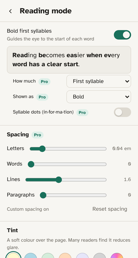
The font change combines with everything else on the screen: bold word starts (free), spacing and syllable dots (Pro), and tint. The Dyslexia preset on the home screen sets Atkinson Hyperlegible together with bolding, spacing and a cream background in one tap.
How to change the font
- Install Emboldened from the Chrome Web Store (it also installs in Edge and Brave).
- Click the Emboldened icon, then Reading mode.
- Under Font, pick Atkinson Hyperlegible, Lexend or OpenDyslexic. The page changes as you choose.
- Try each for a few minutes of real reading rather than a glance; the one that feels least effortful after a page is the one to keep.
- Choose None to return the page to its own font.
Limits worth knowing
A font can only be applied to text. Words inside images, logos and canvas drawings stay as they are. A few sites size their layout to the exact width of their own font, and a wider typeface such as Lexend can make a line wrap where it didn’t; the page reflows rather than breaks, and switching back restores it. Like all extensions, it can’t run on Chrome’s settings pages or in the Chrome Web Store.
Other font extensions
OpenDyslexic for Chrome is the long-standing single-purpose extension, with hundreds of thousands of users: it switches every page to OpenDyslexic and nothing else, and if that’s all you want it does the job. We compare the two in Emboldened vs the OpenDyslexic extension. Helperbird offers a long list of fonts, including Lexend and OpenDyslexic, within a much larger toolkit.
Emboldened’s reason to exist is that the font is one of several adjustments that work better together than alone: a sans-serif face, a little spacing, bolded word starts, a cream background. One screen, every site, nothing you read leaving your computer.
Questions
Is the font change free?
Yes. All three fonts are in the free tier and bundled with the extension.
Which font is best for dyslexia?
The research favours plain sans-serif fonts with distinct letters, and preference matters: readers who like a font read better in it. Try all three on a real page and keep the one that feels least tiring.
Do the fonts work offline?
Yes. They’re inside the extension, not loaded from the web, so they work on every site and without a connection.
Will icons on websites break?
No. Icon fonts are recognised and left alone, and code blocks keep their monospaced font.
Can I use my own font?
Not at the moment. The three bundled fonts cover the main approaches: distinct letterforms (Atkinson), open spacing (Lexend) and weighted letters (OpenDyslexic).
Free to install. Every Pro feature is on for 14 days, no card. Nothing you read leaves your computer.