
How to make websites easier to read with dyslexia
Most websites are laid out for people who read easily: narrow columns, tight lines, pure white backgrounds, a font chosen for looks. You can’t change how sites are built, but you can change how they appear in your browser. This guide covers the six changes with the best evidence or the most consistent reports behind them, what each one does, and how to turn it on, with Emboldened or without it.
1. Widen the spacing between letters, words and lines
This is the change with the strongest research. In a 2012 study in the Proceedings of the National Academy of Sciences (summary), Zorzi and colleagues gave 94 Italian and French children with dyslexia the same text with normal and extra-wide letter spacing. With wide spacing they read about 20 per cent faster and made about half as many errors, with no practice. The explanation is crowding: letters close together interfere with each other, and dyslexic readers are more affected.
The British Dyslexia Association’s Dyslexia Style Guide turns this into numbers: letter spacing around 35 per cent of the average letter width, word spacing at least 3.5 times the letter spacing, and line spacing of about 1.5.
How: In Emboldened, open Reading mode and use the Letters, Words, Lines and Paragraphs sliders (Pro; free for 14 days on install). Without an extension, Chrome’s Reading mode side panel offers letter spacing and line height for the text in the panel only.
2. Use a plain sans serif font, and never italics
Rello and Baeza-Yates tested twelve fonts with 48 dyslexic readers using eye tracking in “Good Fonts for Dyslexia” (2013). Sans serif, roman fonts read fastest; italic versions were significantly worse; readers preferred Verdana and Helvetica. The purpose-built OpenDyslexic did not read faster than ordinary fonts in that study, though many people who learned with it prefer it, and preference matters.
Three fonts are worth knowing. Atkinson Hyperlegible was designed by the Braille Institute to make similar letters (I, l, 1; O, 0) clearly different. Lexend was designed to reduce visual stress with wide spacing built in. OpenDyslexic weights the bottom of each letter to reduce flipping. Try all three; pick the one you stop noticing.
How: Emboldened bundles all three and applies your choice to every site (free). Chrome’s font settings (chrome://settings/fonts) change the default, but most sites override it with their own fonts.
3. Take the glare off: cream, tint or dark
The BDA guide recommends dark text on a light but not pure white background, cream or a soft pastel, because white can look too bright. For some readers this is the biggest single change; for people with visual stress, a tint can be the thing that stops text swimming. See our note on the evidence for tints in visual stress and screen tint: it helps a minority, and it is cheap to find out whether you are in it.
Dark mode is the other way to cut glare, but most dark-mode tools work by inverting the page, which turns photographs into negatives and makes diagrams unreadable. Look for one that recolours text and backgrounds and leaves images alone.
How: Emboldened’s tint (six colours) and dark mode (images untouched) are free; soft white, which turns every white background cream, is Pro. The dim slider, also free, simply turns the page down for bright rooms.
4. Give the eye somewhere to land: bolded word starts
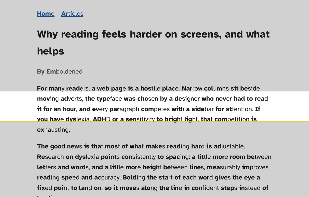
Bolding the first syllable of each word gives the eye a fixed point to jump to. The evidence here is weaker than for spacing: the largest test, by Readwise in 2022, found it did not change reading speed for general readers, as we discuss in does bionic reading work?. But many readers with dyslexia report that bolded starts make words easier to lock on to and lines easier to keep, and since it costs nothing to try, it is worth five minutes of your own test.
How: Emboldened’s first-syllable bolding is free and on by default; it splits words at real syllable boundaries using a 139,000-word dictionary, and never changes the underlying text.
5. Keep your place: a reading ruler
Losing the line is one of the most common complaints: you reach the end of a line and come back to the wrong one. A reading ruler, the on-screen version of the card you might slide down a printed page, shows a clear band around the line you are on and shades the rest. It has no large trial behind it, but the mechanism is simple and the relief is immediate for people who need it.
How: Emboldened’s ruler is free: it follows your mouse, and you set its height and how much the rest of the page is shaded. Alt+Shift+R toggles it.
6. Listen as well as look
Reading with your ears as well as your eyes is one of the oldest and best-supported accommodations for dyslexia; it is why text-to-speech is a standard part of exam access arrangements and workplace adjustments in the UK. Hearing the word while seeing it highlighted takes the decoding load off and lets you attend to meaning.
How: Select text, right-click, “Read selected”: free in Emboldened, with sentence and word highlighting and the voices already on your computer. Reading from any paragraph you click, and reading whole articles in reader view, are Pro.
Putting it together
You don’t need all six. A common set-up for an adult with dyslexia is wider spacing, a sans serif font, a cream background and read-aloud for anything long. Someone whose main problem is losing the line adds the ruler. Someone with visual stress adds a tint. Emboldened’s Dyslexia preset switches on the spacing, font and bolding in one tap, and everything can be adjusted from there; it is free to install from the Chrome Web Store. Whatever you use, set it up once and let it apply everywhere: the help only works if it is there on every page without you thinking about it.
Two things that don’t help
Justified text, which creates rivers of uneven spacing; the BDA guide says left-align, and if a site justifies, a reader view that strips its styling fixes it. All capitals and underlining, which change word shapes and make them harder to recognise; there is nothing you can do about a site that uses them except read it in reader view.
Questions
Which single change should I try first?
Spacing. It has the clearest evidence, and most people feel the difference within a paragraph. Then the background.
Do these work on every website?
Browser-level changes apply to any normal page. The exceptions are the browser’s own settings pages and the Chrome Web Store, where Chrome allows no extensions, and text boxes you are typing in, which a well-behaved extension leaves alone.
Is any of this a treatment for dyslexia?
No. These are accommodations: they make the text you have to read today easier. Dyslexia itself is addressed by structured literacy teaching, and nothing in a browser replaces that.
What about on my phone?
Chrome on Android and iOS doesn’t run extensions. Use the phone’s own accessibility settings: larger text, bold text, reduced white point (iOS) or extra dim (Android), and the built-in reader modes in Safari and Chrome.
Free to install. Every Pro feature is on for 14 days, no card. Nothing you read leaves your computer.