
Increase letter spacing on any website
Extra space between letters is the best-evidenced single change you can make to text for a reader with dyslexia. Emboldened lets you add it to any web page with a slider, alongside separate sliders for word, line and paragraph spacing, and it applies live without reloading. Spacing is a Pro feature, free to try for 14 days.
Why letter spacing works
The clearest study is Zorzi and colleagues, published in PNAS in 2012 under the title “Extra-large letter spacing improves reading in dyslexia”. Ninety-four children with dyslexia, 54 Italian and 40 French, read a short text with normal spacing and again with the letters spread further apart. With the wider spacing they read about 20% faster and made roughly half as many errors, with no training and no practice. The authors’ explanation is crowding: letters packed close together visually interfere with each other, and readers with dyslexia are unusually affected by that interference. Spread the letters out and the interference drops.
That finding is why the British Dyslexia Association’s style guide recommends increased inter-letter spacing, ideally around 35% of the average letter width, with word spacing at least 3.5 times the letter spacing and line spacing of about 1.5. We go through the research, including the studies that found smaller effects, in letter spacing and dyslexia: the research.
The catch is that almost no website is set that way. Designers choose tight spacing because it looks neat. A spacing extension lets you override the designer’s choice on every site at once.
How Emboldened’s spacing works
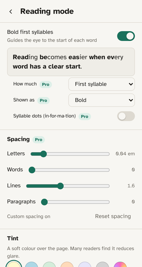
The Reading mode screen has four sliders:
- Letters: the gap between characters.
- Words: the gap between words, so that wider letter spacing doesn’t make the words run together.
- Lines: the vertical distance between lines.
- Paragraphs: the space between paragraphs, which makes the structure of a long page visible.
Each slider applies to the page as you drag it, so you can see the text open up and stop where it reads best. The settings follow you to every site. Where a page has been laid out so tightly that spacing would break it, Emboldened leaves text boxes, editors and code alone, so you don’t find your email composer re-spaced.
Spacing works well with the free settings around it. The Dyslexia preset on the home screen sets bolded word starts, all four spacing sliders, the Atkinson Hyperlegible font and a cream background in one tap: in effect, the BDA style guide applied to the whole web.
Letter spacing and bold word starts together
Wider spacing attacks crowding between letters; bolded word starts give the eye a fixed point to land on in each word. Used together, the text is both less cluttered and more structured, and most readers find the combination stronger than either alone. Bolding is free and on the same screen, so the natural order is to switch bolding on first, then add spacing until the page settles.
How to set it
- Install Emboldened from the Chrome Web Store.
- Click the Emboldened icon, then Reading mode.
- Drag Letters to the right until words stop looking crowded. A little goes a long way; the Zorzi study used spacing well beyond what any website ships with, and most people find a gentler setting is what they want for everyday reading.
- Nudge Words up so the words stay distinct, then set Lines to taste. Many readers settle around the BDA’s 1.5.
- Press Reset on the same screen to go back to the page’s own spacing.
Spacing is part of Emboldened Pro, which is on for 14 days when you install, with no card and no sign-up.
Limits worth knowing
Spacing changes the width of text, so on a page with a rigid layout, a narrow sidebar or a fixed-width table, a line may wrap where it didn’t before. That’s the page reflowing, not breaking, and switching the slider back restores it. Text drawn as images or inside canvas elements can’t be spaced, because it isn’t text as far as the browser is concerned. And, as with every extension, it can’t run on Chrome’s own settings pages or in the Chrome Web Store.
Other ways to add spacing
Helperbird offers letter, word and line spacing among a large set of accessibility features, with a free tier and a paid one; it’s a good choice if you want a very wide toolkit. Microsoft Edge’s Immersive Reader has text spacing too, but only inside its own reader layout on pages it recognises as articles. Our comparison with Helperbird sets out the differences plainly.
Emboldened’s angle is that spacing sits with the other things the research supports for dyslexia, bolded word starts, syllable dots, a sans-serif font, a cream background, in one screen, applied live, with nothing you read leaving your computer.
Questions
Is letter spacing free?
The four spacing sliders are part of Emboldened Pro. Every Pro feature is on for 14 days when you install, so you can see whether spacing helps before paying.
How much spacing should I use?
Start small. The BDA suggests letter spacing of about 35% of the average letter width and line spacing of about 1.5. Drag the sliders until the words stop looking crowded, and no further; too much spacing makes words fall apart.
Will it break page layouts?
Lines may wrap differently, because the text is wider. Pages reflow rather than break, and the Reset button puts the page’s own spacing back.
Does it change what I type?
No. Text boxes, editors and forms are left exactly as they were.
Can I have spacing on but no bolding?
Yes. Every setting is independent; bolding, spacing, font and tint can each be on or off.
Free to install. Every Pro feature is on for 14 days, no card. Nothing you read leaves your computer.