
Dyslexia-friendly fonts explained
Fonts sold as “designed for dyslexia” have been tested several times and have not beaten ordinary fonts. What does help is plainer: a clean sans-serif, no italics, a comfortable size, and the spacing around the letters. Here is what the studies found, what the British Dyslexia Association recommends, and why the right answer is usually “the font you find easiest”, applied to every page you read.
The claim behind dyslexia fonts
Dyslexie (Christian Boer, 2009) and OpenDyslexic (an open-source font from 2011) share an idea: give each letter a heavy bottom so it looks “anchored”, make similar letters such as b, d, p and q more distinct, and widen the spacing. The story is that this stops letters flipping, rotating and swapping. It is an appealing story, and it is testable.
What happened when they were tested
Rello and Baeza-Yates, 2013. In “Good Fonts for Dyslexia”, presented at the ACM ASSETS conference, 48 readers with dyslexia aged 11 to 50 read texts in 12 fonts while their eyes were tracked. Reading was fastest and fixations shortest with sans-serif, monospaced and upright fonts; italics made reading significantly worse. Helvetica, Courier, Arial, Verdana and Computer Modern came out best. OpenDyslexic did not improve readability or reading speed, and readers strongly preferred Verdana and Helvetica to it.
Wery and Diliberto, 2017. Published in Annals of Dyslexia, “The effect of a specialized dyslexia font, OpenDyslexic, on reading rate and accuracy” tested primary-school children with dyslexia and found no improvement in reading rate or accuracy with OpenDyslexic compared with Arial and Times New Roman. None of the children preferred it.
Kuster, van Weerdenburg, Gompel and Bosman, 2017. Also in Annals of Dyslexia, “Dyslexie font does not benefit reading in children with or without dyslexia” ran two experiments: 170 Dutch children with dyslexia reading in Dyslexie and Arial, then 147 children with and without dyslexia reading in Dyslexie, Arial and Times New Roman. Reading did not differ by font for any group, and more children preferred Arial.
Three studies, three countries, children and adults, and the same result. The special fonts are not harmful, and some individuals like them, but the design features they advertise do not produce measurable reading gains.
Why the spacing is the interesting part
Both Dyslexie and OpenDyslexic have generous letter and word spacing built in. Separate research, led by Zorzi and Ziegler and published in PNAS in 2012, found that extra letter spacing alone made children with dyslexia read about 20% faster with half the errors. That is a large, immediate effect from spacing, with no special letterforms involved. The likely explanation for any benefit people report from dyslexia fonts is the spacing, not the heavy bottoms. There is a full account in letter spacing and dyslexia: the research.
The practical consequence: control the spacing directly, and choose the font on comfort.
What the British Dyslexia Association recommends
The BDA Dyslexia Style Guide is the reference most UK schools, universities and employers use. Its font advice is deliberately unglamorous:
- Sans-serif typefaces such as Arial, Verdana, Tahoma, Century Gothic, Trebuchet, Calibri or Open Sans, because they reduce crowding.
- Body text of 12 to 14 point, or 16 to 19 px on screen, larger if the reader asks.
- Letter spacing around 35% of the average letter width; word spacing at least 3.5 times that; line spacing of 1.5.
- Bold for emphasis, never italics or underlining; no continuous capitals.
- Dark text on a cream or pastel background rather than pure white, which “can appear too dazzling”.
- Lines of 60 to 70 characters, left-aligned, not justified.
Nothing on that list is a special font. It is about clear shapes, size, spacing and contrast.
Three fonts worth knowing
Within “clean sans-serif”, a few fonts were designed with legibility as the brief rather than style, and they are the ones worth having available.
- Atkinson Hyperlegible, from the Braille Institute, exaggerates the differences between easily confused characters, such as capital I, lowercase l and the digit 1, and between b and d, without looking unusual. It was designed for low vision, and the same distinctness helps anyone.
- Lexend was designed around reading fluency, with wide spacing and simple shapes. It is a Google font, so it is common on the web.
- OpenDyslexic did not win in the studies, but a minority of readers like its weighted shapes, and if you are one of them that preference is a good enough reason to use it.
Emboldened bundles all three, so they work on every site without downloading anything, and lets you apply any of them to the page you are reading with a tap. That is in the free tier. Install from the Chrome Web Store (works in Edge too); the step-by-step is on the font extension page.
How to choose, in practice
- Pick a font by reading a few paragraphs in each. Comfort is the measure; a font you dislike will not read well whatever the study says.
- Set the size to something you do not have to lean in for. On screen, 16 to 19 px is the BDA’s range.
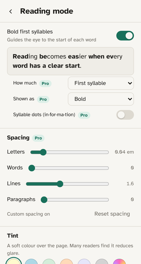
- Add spacing: letter, word and line, nudged up until words feel airy but still read as words. (Spacing sliders are in Emboldened Pro, free for 14 days on install.)
- Get rid of pure white if it glares, with a cream background or a soft tint.
- Add first-syllable bolding, which gives each word a fixed landing point. Rello and Baeza-Yates found upright, non-italic text read best; bolding the start of a word is a different kind of emphasis and does not have that cost.
None of this changes the page’s text. Copying and pasting still gives the original words, and switching Emboldened off restores the page exactly.
Questions
Do dyslexia fonts actually work?
Three controlled studies, Rello and Baeza-Yates (2013), Wery and Diliberto (2017) and Kuster et al. (2017), found no reading benefit from OpenDyslexic or Dyslexie compared with ordinary fonts such as Arial. Some individuals prefer them, which is a fine reason to use one, but the advertised effect has not held up.
What is the best font for dyslexia?
On the evidence: a clean sans-serif you find comfortable, upright, at 16 to 19 px, with generous spacing. Verdana, Arial and Helvetica tested well; Atkinson Hyperlegible and Lexend were designed for legibility and are good choices.
Is spacing more important than the font?
Yes, on current evidence. Extra letter spacing produced a large, immediate improvement in a 2012 PNAS study; special fonts produced none. The spacing built into dyslexia fonts is probably why some people find them easier.
Can I change the font on every website?
With an extension, yes. Emboldened applies Atkinson Hyperlegible, Lexend or OpenDyslexic to any page live, without reloading, and you can switch it off for sites where the original font matters.
Free to install. Every Pro feature is on for 14 days, no card. Nothing you read leaves your computer.